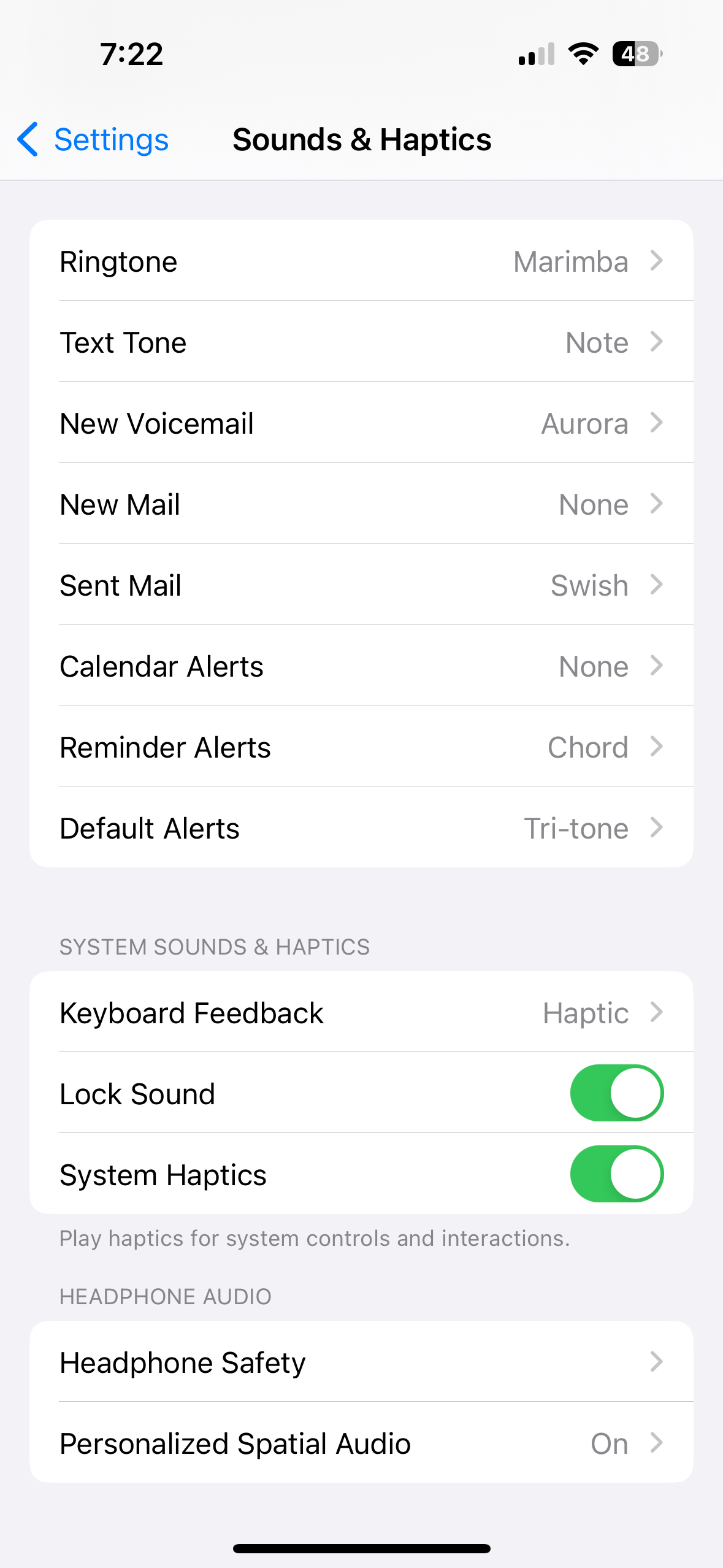
What an amazing cutting edge breakthrough. Truly frontier technology. The mind boggles.
Look at the new emojis though. Pure art
I thought we’d seen it all when they finally let people change the default notification sound in iOS 17!
I will be shocked if they figure out how to use MP3 files as notification sounds. Then I’ll believe we are truly living in the future.
Now that’s just fantasy talk
I’m sorry, I’m browsing from /all. You don’t actually mean they only started allowing notification sound customization 17 versions into their OS, right? You’re making a joke?
Because holy hell, what basic functionality that should have been included over a decade ago.
You could change the defaults for a number of things, but not the miscellaneous stuff. The “default” category is new.
It’s really weird, because Apple has been selling tones forever, and they had a tone selection component already. It’s like someone just never prioritized the day of work in their jira backlog.

What was Android’s most recent groundbreaking feature, and when was it released?
Nobody said android is making leaps and bounds recently either. Just a stupid joke about how long it took them to add this very basic feature lol
Oh, you mean the same stupid joke we can read in literally every comment thread about Apple adding features to iOS?
Oh… you’re one of those apple fans.
Oh… you’re one of those critics.
Lol dude I made a joke and you are clearly just taking it personally. Showing clear anger over phones.
Not sure where I showed ‘clear anger’ but you do you.
Every modern release of iOS is more like Android, and every modern release of Android is more like iOS. Welcome to convergent evolution.
By 2030, the only major difference between Android and iOS will be that, when you hit the bottom of a scrolling page, one will be a little bouncy and the other will be a little stretchy.
People will still fight over which OS is the best.
Can’t wait until iOS 19 where they add an App drawer.
Welcome, to the world of 2015!
this is an unpopular opinion but i know the aesthetic reason for apple not implementing this for so long, and like eveything, it’s to make money.
android design is pretty good, but user created android phones home screens can often look pretty hateful, often with 4-6 screens of more empty space than icons, tons of widgets with an inconsistent design scheme, random half empty folders and a notification bar overcrowded with overshrunk icons. android phones often look like old Windows XP desktops—even on flagship distributions.
in contrast to google, apple cares what your phone looks like because they have a highly visual brand.
apple, by not allowing placement anywhere intentionally enforced a consistent top-left to bottom-right aesthetic which is now ubiquitous to the brand. among other design decisions, the result is that when you blur your eyes and look at a phone home screen you can tell whether it is apple or not.
- but the functionality is worse, yes i know.
- but it actually does look worse too, to you maybe, but not to apple. my belief is they did this for the same reason they put the magic mouse’s lighting port on the bottom (to keep users from always using it plugged in. which looks “ugly”).
the power of a strong and unmistakable brand is incomparable. in many cases, the value of a brand can even outperform raw product utility when it comes to customer satisfaction, a theory which i believe apple has been leveraging in this case very much intentionally despite the seeming paradox of utility.
edit: already getting downvoted to heck i should have known better than to be aware of basic marketing principles lol. i promise you im not defending apple im just explaining why they did this to make more money.
I totally agree, and would argue that this enshittification for their own benefit began around the iPhone 4 and iOS 7. Things were beautiful to see in promotional videos but they wrecked years of visual conventions and features for aesthetics. The actively choose profits and aesthetics over their users.
Off topic but I never see articles posted here about what the new features in Android are going to be, but Apple haters will undoubtedly let me know what I can expect to see in iOS.
It’s almost as if this is the c/apple community and not the c/android community, or something.
You’d think that, but really most of the comments are just from people coming in from c/all
What does that have to do with anything? It’s a post about Apple, posted to c/Apple, where people (from wherever) are discussing features of the Apple OS. Shouted’s complaint still makes no fucking sense. If you go to c/Android, where people make posts about Android, you’ll see also plenty of people (from wherever) making all sort of comments, that also include complaints about Android’s upcoming features. It’s the most non-complaint in history. “People are using the website as intended to make fun of my phone! waaahhh!”
This is c/apple_enthusiast, not c/apple
iOS lookin more like Android with each release.
And as a developer android is looking more and more like iOS as it becomes more restricted on what you can do.
The two are converging
Source: literally spending my day today dealing with every more restrictive APIs on newer Android versions


