Sweetpeaches69@lemmy.world to politics @lemmy.world · 4 months agoCrowd Leaves Early As Trump Delivers 90-Minute Attack on 'Crazy Kamala'www.msn.comexternal-linkmessage-square45fedilinkarrow-up1368file-text
arrow-up1368external-linkCrowd Leaves Early As Trump Delivers 90-Minute Attack on 'Crazy Kamala'www.msn.comSweetpeaches69@lemmy.world to politics @lemmy.world · 4 months agomessage-square45fedilinkfile-text
minus-squarejonne@infosec.publinkfedilinkarrow-up3·4 months agoI love how Trump forced the poster designers to make Vance smaller even if it’s the same amount of characters.
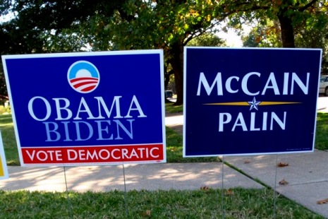
minus-squaremorphballganon@lemmy.worldlinkfedilinkarrow-up19·edit-24 months agoWell, it’s pretty common for the VP name to be in smaller print, to indicate that they’re two different names. Examples:
minus-squareEch@lemm.eelinkfedilinkEnglisharrow-up8·4 months agoWhile I’d fully expect two-scoop donald to throw a fit over it, that’s also just pretty standard graphic design. Helps differentiate the vp candidate from the main candidate.
I love how Trump forced the poster designers to make Vance smaller even if it’s the same amount of characters.
Well, it’s pretty common for the VP name to be in smaller print, to indicate that they’re two different names.
Examples:
While I’d fully expect two-scoop donald to throw a fit over it, that’s also just pretty standard graphic design. Helps differentiate the vp candidate from the main candidate.