I’d argue it’s literally the opposite of what you’re saying. They are trying to make the product easier to use by making it explicit what the icon is for. If that makes you happy, that’s not locking you in.
They do plenty of locking in. This is not that.
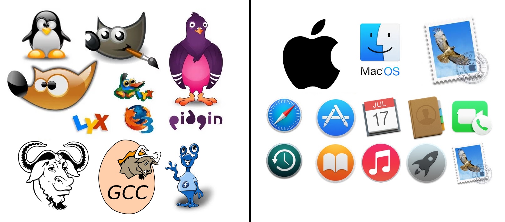
I’d much rather tell grandma “the music player is the music notes” … she’ll remember that. and not “the music player is the one with the lightning bolt” because she won’t remember that.
Even if you don’t like him. I highly doubt Jony Ive designs things by just googling cartoons. Lots of thought went into these icons. I feel like these are from multiple eras of macOS… Theres the “consistent” ones (the circles) and the “skeumorphic” ones (the stamp, the contact book, calendar)
As far as ICONs go, I vastly prefer the ones on the right. As far as brand mascots go, I prefer the ones on the left.
We’re not even comparing apples and oranges here. Neither side is soulless, theyre just achieving different objectives and you seem to have a bone to pick with apple.

Yeah thats what soulless is in this case. The monopoly and locking users into only buying things with a bitten off apple.
Apple probably googled for some just cartoon style and used the first thing.
I’d argue it’s literally the opposite of what you’re saying. They are trying to make the product easier to use by making it explicit what the icon is for. If that makes you happy, that’s not locking you in.
They do plenty of locking in. This is not that.
I’d much rather tell grandma “the music player is the music notes” … she’ll remember that. and not “the music player is the one with the lightning bolt” because she won’t remember that.
Even if you don’t like him. I highly doubt Jony Ive designs things by just googling cartoons. Lots of thought went into these icons. I feel like these are from multiple eras of macOS… Theres the “consistent” ones (the circles) and the “skeumorphic” ones (the stamp, the contact book, calendar)
As far as ICONs go, I vastly prefer the ones on the right. As far as brand mascots go, I prefer the ones on the left.
We’re not even comparing apples and oranges here. Neither side is soulless, theyre just achieving different objectives and you seem to have a bone to pick with apple.