You must log in or # to comment.
my youngest sibling says their gender changes to make them gay for anyone they’re attracted to
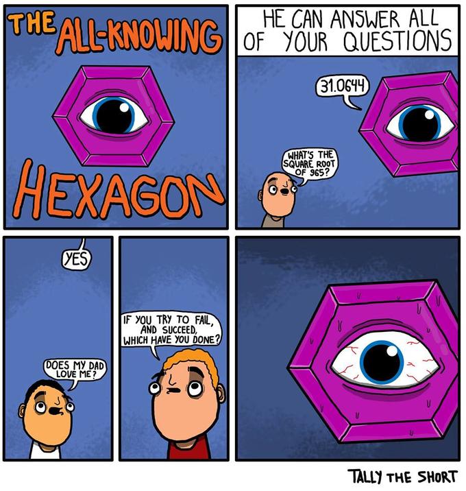
In the original comic, the hexagon is off-panel in panel 3. Also several speech bubbles have been moved around. Who edited these things and why? Also super lame to crop out the comic’s title.

They appear to be moved around because the original creator [didn’t] put the text boxes in intuitive places. It’s instinct to read from top to bottom if both text bubbles are centered at the same spot.
EDIT: missed an important word
Outside of the crop, the edit is a big improvement to readability for me. Trying to read the original was really confusing for a second.


